Deleted
Deleted Member
Posts: 0
|
Post by Deleted on May 28, 2016 1:06:49 GMT
Tull albums have certainly had many memorable, different, and unique designs.
|
|
|
|
Post by Budding Stately Hero on Oct 7, 2018 21:10:09 GMT
Dot Com, to me, is the ugliest of their album covers. It's not in the slightest bit appealing.
|
|
|
|
Post by JTull 007 on Oct 7, 2018 22:15:59 GMT
|
|
|
|
Post by Budding Stately Hero on Oct 7, 2018 22:29:29 GMT
I suppose he got tired of making album covers in his likeness.  |
|
|
|
Post by deafmoon on Jan 18, 2019 22:47:19 GMT
Stand Up was always very cool to me. That album just showed Tull in their hippie years.
|
|
|
|
Post by orion12 on Oct 23, 2020 18:10:38 GMT
Best cover: 'The Broadsword and the Beast'
Worst cover. 'A'
|
|
|
|
Post by maddogfagin on Oct 24, 2020 15:22:38 GMT
Best cover: 'The Broadsword and the Beast' Worst cover. 'A' Going out on a limb here (legs allowing  ) Best Cover: Roots To Branches Worst Cover: Original Masters |
|
|
|
Post by jackinthegreen on Oct 24, 2020 16:23:59 GMT
I like the early ones,
Stand Up
Thick as a Brick
Aqualung
A Passion Play
Broadsword
|
|
|
|
Post by acreman on Oct 24, 2020 18:21:15 GMT
I'm inclined to say that the Benefit cover is my favorite, but that might have something to do with me associating it very closely with the music, as Benefit is my favorite Tull album. Perhaps I'd go with Stand Up's cover if I were being more "objective."
It's hard to call one the worst, as I don't particularly dislike any of them. I guess This Was or Under Wraps would be my least favorite.
|
|
|
|
Post by Jack -A- Lynn on Oct 24, 2020 19:23:42 GMT
I'm inclined to say that the Benefit cover is my favorite, but that might have something to do with me associating it very closely with the music, as Benefit is my favorite Tull album. Perhaps I'd go with Stand Up's cover if I were being more "objective." It's hard to call one the worst, as I don't particularly dislike any of them. I guess This Was or Under Wraps would be my least favorite. Benefit has a very nice and smart cover. The idea with the two windows and looking through them, that looking from the other window and we find that we are Jethro Tull or Jethro tull is us(?) it was mind-blowing, i liked it so much! Ok, The Broadsword and the Beast cover is amazing, Thick as a brick cover was wonderful idea, i like almost all. And the cover of Original Masters i think is a very nice picture of Ian! Also love these images of him where he is doing his crazy wonderful things, poses that camera catches him up on his performance ❤️ |
|
|
|
Post by acreman on Oct 24, 2020 22:25:10 GMT
Benefit has a very nice and smart cover. The idea with the two windows and looking through them, that looking from the other window and we find that we are Jethro Tull or Jethro tull is us(?) it was mind-blowing, i liked it so much! And both band and audience "benefit" from the music...and from each other's presence as well. |
|
|
|
Post by nonrabbit on Oct 25, 2020 19:20:40 GMT
I'm inclined to say that the Benefit cover is my favorite, but that might have something to do with me associating it very closely with the music, as Benefit is my favorite Tull album. Perhaps I'd go with Stand Up's cover if I were being more "objective." It's hard to call one the worst, as I don't particularly dislike any of them. I guess This Was or Under Wraps would be my least favorite. Benefit's my favourite album as well however the cover is not in my top ten. I like the concept (dare I use the word!) as you mentioned, I think it was the dull colours that put me off. My fav is Broadsword & the Beast. For the jeweled colours; Norse pirate Ian and the water dripping out the frame. I have a connection with the artist Iain McCaig re the art school he went to in Glasgow - him being tutored there and me partying at the same time! I asked him if he was influenced - in all his work, by the art/architecture of Glasgow and he said more than people realise. |
|
|
|
Post by Budding Stately Hero on Jun 17, 2021 20:41:07 GMT
Best cover: 'The Broadsword and the Beast' Worst cover. 'A' Yeah! What are they looking up at, a UFO landing or something? Or are they in some nuclear facility? I commend Ian for trying to stay current with the sound of the times (trends in the early 80's), and therefore I like the music on the album, but the cover. D+ for the cover. |
|
|
|
Post by JTull 007 on Jun 18, 2021 1:17:27 GMT
Everyone has a favorite and some not so favorite album cover design.
I was very impressed by the cover and imagination which is still available A LA MODE 
|
|
|
|
Post by woodsongs on Apr 1, 2022 17:57:50 GMT
I must admit I like all of the Jethro Tull album covers. The only one I don't like at all is 'The Zealot Gene'. I do love the album though - but the cover? Surely the worst?  |
|
|
|
Post by JTull 007 on Apr 2, 2022 0:16:19 GMT
I must admit I like all of the Jethro Tull album covers. The only one I don't like at all is 'The Zealot Gene'. I do love the album though - but the cover? Surely the worst?  
I respect those who may be less impressed with this design... BUT  This is so unique This is so unique  Image by Raimund Hanesch Image by Raimund Hanesch |
|
|
|
Post by Budding Stately Hero on Apr 2, 2022 14:47:33 GMT
I must admit I like all of the Jethro Tull album covers. The only one I don't like at all is 'The Zealot Gene'. I do love the album though - but the cover? Surely the worst? I agree with you. Ian's album covers spark one's imagination (After 50+ years later we are still discussing why they were dressed up as old men with dogs) from the literal to the abstract. A nondescript photo of him, and a bad one at that, says nothing and does nothing for what the listener is to expect upon listening to the music. Yes, I know, Phil Collins and a host of others. It's just that this is the first time he's done such a thing without trying to project an image (unless that image is of some angry working John working Joe at home writing hostile messages on Facebook). Perhaps, that's just it. Perhaps, Ian is saying two things; "This character is that of an ordinary man in 2020, who is projecting all his anger and ugliness out into subspace, in a passive aggressive way and / or "After 55 years, this is Ian Anderson. I am, and have always been (the face of) Jethro Tull, make no mistake about that, regardless of who I chose to accompany me from time to time". This is not the way I see if for those artists who have made a career of plastering blowups of their faces (Collins, Stewart, Springsteen et al.) on most of their albums covers. I have always been somewhat suspicious of artists who have five plus band mates play and compose music on an album where only one person retains the pictorial credit. That's akin to Arsenal's team photo only consisting of it's goalie. |
|
|
|
Post by woodsongs on Apr 4, 2022 13:37:13 GMT
I must admit I like all of the Jethro Tull album covers. The only one I don't like at all is 'The Zealot Gene'. I do love the album though - but the cover? Surely the worst? I agree with you. Ian's album covers spark one's imagination (After 50+ years later we are still discussing why they were dressed up as old men with dogs) from the literal to the abstract. A nondescript photo of him, and a bad one at that, says nothing and does nothing for what the listener is to expect upon listening to the music. Yes, I know, Phil Collins and a host of others. It's just that this is the first time he's done such a thing without trying to project an image (unless that image is of some angry working John working Joe at home writing hostile messages on Facebook). Perhaps, that's just it. Perhaps, Ian is saying two things; "This character is that of an ordinary man in 2020, who is projecting all his anger and ugliness out into subspace, in a passive aggressive way and / or "After 55 years, this is Ian Anderson. I am, and have always been (the face of) Jethro Tull, make no mistake about that, regardless of who I chose to accompany me from time to time". This is not the way I see if for those artists who have made a career of plastering blowups of their faces (Collins, Stewart, Springsteen et al.) on most of their albums covers. I have always been somewhat suspicious of artists who have five plus band mates play and compose music on an album where only one person retains the pictorial credit. That's akin to Arsenal's team photo only consisting of it's goalie. I'm sure the cover must have put some 'casual' buyers off buying the album. I don't know what I was expecting from the cover when the album was announced, but I felt disappointed when I saw it. I think the inner booklet would have made a better cover to be honest. I think it would have been too much to expect a cover in a similar vein to ' The Broadsword & The Beast I suppose. Never judge a book by the cover though! I do really like the contents.  |
|
|
|
Post by wordnat on Sept 6, 2022 9:35:13 GMT
j-Tull.com is the worst cover in the history of album
Covers. Instantly dated.
|
|
|
|
Post by JTull 007 on Mar 10, 2023 1:19:33 GMT
Images by Marcus Niermann In the early 2000s Chrysalis Japan released the remastered CDs in mini-LP sleeves,
very faithful to the originals. They also made "picture CDs" of the albums
This Was to Heavy Horses (with the exception of LitP). 
|
|


 I LOVE IT !!!
  I'm Aries
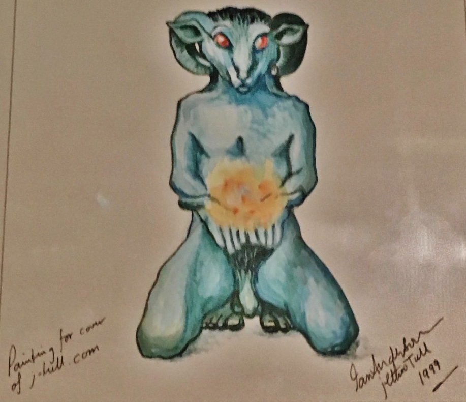


 )
)


 This is so unique


